


In Guideline 3.2, we discussed why it’s important that pages appear and operate in a manner that is predictable and intuitive. Now we’ll talk about the criteria of Guideline 3.3, which outlines ways you can help users avoid and correct mistakes.
Identifying Errors
Let’s say you’re upset because you made a really good sandwich for lunch but then dropped it on the floor right before you could eat it, so you decide to do some online shopping to ease the pain.
[Source: https://shop.marvel.com/]
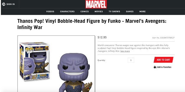
You accidentally enter an incorrect credit card number. Rather than confirming completion of your order, the form simply reloads. Was it your fault, or was it a site error? If you fill in the form again, will you be charged twice? How are you supposed to know what went wrong?
If your site automatically detects a user input error, the incorrect field or item should be identified, and a description of the error should be provided. This will help those with low or no vision or colorblindness, who would otherwise have difficulty ascertaining that an error had occurred, as well as people experiencing disabilities who have trouble comprehending visual cues.
It’s important to be as specific as possible in error messages. For instance, if you simply indicate that a field is in error, someone using a screen reader won’t necessarily know what’s wrong until he or she encounters the indication. An error can also be indicated using an image, color, or other visual cue, as long as a text description is also provided.
One More Thing
Imagine that you’re bidding on an item in an online auction. You accidentally submit a bid that is less than the current amount, but the site, in turn, automatically corrects your mistake and raises your bid to a sufficient amount. Even though the issue resolved itself, you must still provide the user with a description of the error that was made.
Other Insights


Contact Us
Monday Loves You
1770 West Berteau Avenue, #206
Chicago, IL 60613
312.973.1112
hi@mondaylovesyou.com
©Duple Meter LLC 2024
Contact Us.
Monday Loves You
1770 West Berteau Avenue, #206
Chicago, IL 60613
312.973.1112
hi@mondaylovesyou.com