


Much like your mother-in-law, you don’t want your website to be frustrating or annoying. We established in WCAG 1.4.1 that users with visual impairment might need to resize the text on your site to read it. In this section, we’ll focus on making sure that when a user resizes the text, the website accommodates the changes in a way that ensures continued ease of use of the site.
Feel the (Re)flow
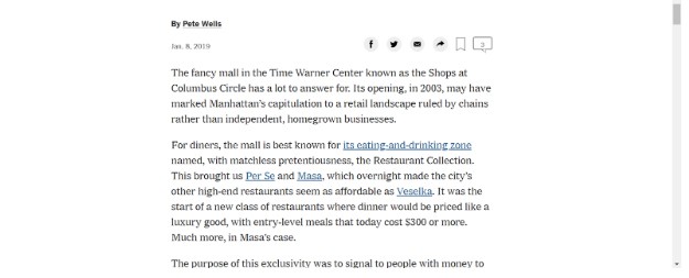
If the zoom function on a user’s browser scales the content on your site to 400%, the content should reflow such that it appears in one column and scrolling in two directions is unnecessary. There’s a good chance you’ve seen reflow in action before. As a quick illustration, let’s take a look at this article from the New York Times:
Here’s the page at normal view (100% zoom):
[Source: https://www.nytimes.com/2019/01/08/dining/momofuku-bang-bar-review.html]
And here’s the same page at four times the normal view (400% zoom):
[Source: Same as previous image]
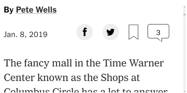
Notice that the text has shifted so that the article can be read continuously without having to scroll from side to side. The share buttons at the top of the article have also moved to fit inside the enlarged view
Flow Notes
Reflow isn’t required for content that would lose its meaning or operability if it did not appear in its standard manner. Examples of such content can include images, maps, videos, games, diagrams, presentations, data tables, and interfaces where users need to keep the toolbar in view while modifying content, such as a paint program.
It’s also worth noting that there may be times when the content of a page reflows in such a way that not all elements are fully visible. For instance, navigation menus that are fully visible in standard view are sometimes collapsed in some manner in an enlarged view. In this situation, while the menu isn’t visible, it’s important that it’s functionality is still available if users need to access it.
Responsive Web Design
Browsers and other user agents for technologies like HTML/CSS, PDF, and ePub tend to have means of reflowing content to fit the width of a window when the content is authored appropriately. This is referred to as Responsive Web Design, and you can find additional resources and information about it at these MDN Web Docs and Google Developer pages.
Other Insights


Contact Us
Monday Loves You
1770 West Berteau Avenue, #206
Chicago, IL 60613
312.973.1112
hi@mondaylovesyou.com
©Duple Meter LLC 2024
Contact Us.
Monday Loves You
1770 West Berteau Avenue, #206
Chicago, IL 60613
312.973.1112
hi@mondaylovesyou.com